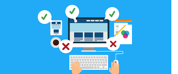
5 Mistakes to Avoid in Website Design
1. Social Media Icons in Header
If the client gets one visitor to the site every time, that's a minor success. So why would you give them an exit warning under the name of “check out our social media too”? The main task of social media campaigns is to redirect to the customer's site through social media platforms, in fact, it is the opposite. For this reason, removing the visitor from the page, even if it is for the same purpose, is nothing more than defeating the purpose of the visit. Because he gets distracted and never returns to the page.
2. Stock Image Like Stock Image
The use of large and horizontal images in web design is very trendy and it is a fact that such images increase interaction. However, unfortunately, while searching for an image suitable for this format, the stock photo cliché was stuck and certain images began to come to the fore on every web page. Pages that used unoriginal and unnatural, overly artificial and unrealistic photographs began to disturb visitors after a while.
3. Email Links
If you have created a field such as "Biography" while designing a web page, e-mail links will definitely be included on the page. E-mail is the most effective way for one-on-one interaction in the business world. However, using an e-mail link may have some benefits. First of all, when you click on an e-mail link, the computer automatically connects you to the e-mail server (e.g. Outlook) and automatically adds the e-mail address to your contacts. This is a natural problem because you are clicking on a program you will not use, and it is a problematic method because you will have trouble copying and pasting that address afterwards. Moreover, the worst part is that when you click on e-mail links, spam e-mails continue to be sent to you by robots.
4. Customer-Focused Sales Text That Smells like “Advertising”
The thing that has nothing to do with design but you need most on a website is improved marketing texts. However, in this field, praise-filled phrases resulting from the use of many wrong words are often used. The truth is that the visitor is not so unqualified to believe these photocopied texts. What your visitors really want to get from your page is basic information about your service. “What exactly is this product/service, what benefit will it provide me, how will it work for my benefit?” He keeps asking basic questions like these in his mind while browsing the site. Therefore, “Click, win!/ Realize your privileges.” Groups of words that do not actually mean anything, such as these, will be nothing more than a bunch of words. Likewise; The founding date of your company in a sentence such as “Service with the same quality since 1983…” does not interest your visitors and is not that important to them. Therefore, writing similar texts in large fonts will only direct attention to the wrong place.
5. Transparent CTA Buttons
It seems like transparent buttons came into our lives to prove that appearance is more important than function. This trend, which has been effective since last year, is defined as making a contour frame to create a button instead of painting the inside. Although this minimal and simple design looks perfect, it creates a small problem; It reduces the click rate considerably. The probable reason for this is that it does not look like a button because its inside is transparent. Even though it is clicked only by conscious users, unfortunately this is not enough in the online world.
